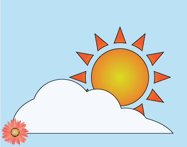
Sun and Cloud
For this project we practiced using the path finder tool to
create compound shapes. The ellipse tool and the star tool played a major role
in forming the base for the sun and clouds. In order to give the sun a
realistic effect I added a radial gradient while keeping the rest of piece
solid colors.
create compound shapes. The ellipse tool and the star tool played a major role
in forming the base for the sun and clouds. In order to give the sun a
realistic effect I added a radial gradient while keeping the rest of piece
solid colors.
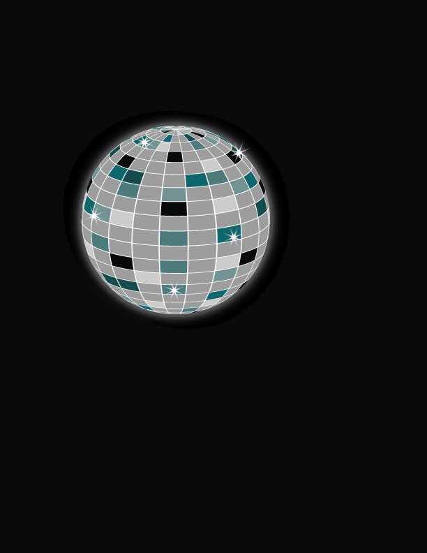
Disco ball
For the Disco ball project I first needed to create a pattern that resembled a disco ball. We did this by setting up a
large rows squares, then afterwards randomly filled the squares with colors that fit the project. After the pattern
was complete I created part of the ellipse and used the 3D effects revolve to create sphere and apply the pattern.
To finish I just added flashes of light with the star tool and a glow with the blur effect.
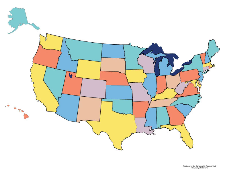
USA
The US map was quite simple. All i had to do was outline the states with the pen tool and then fill each sate with the correct color, I did this by using the eye dropper tool and then fill tool.
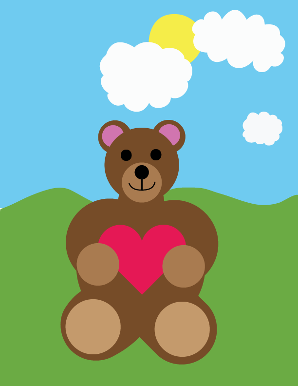
Bear
This bear tutorial was completed by watching a video tutorial. Using the blob brush along with complex shapes played the biggest part in completing this bear tutorial. This tutorial was completed in a couple class periods. I have no intent on returning to this project.
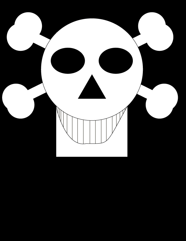
Skull
This skull tutorial was quite simple and really only involved using and creating complex shapes in illustrator. The pen tool was used to draw the outline of the mouth . I might revisit this idea but attempt to make a more realistic skull.
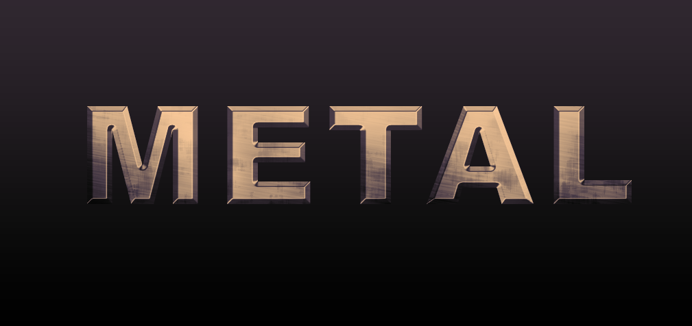
Metal layer style
This tutorial was taken from Psdtuts.com with the purpose of creating a metal texture. Reflecting back on this tutorial it focused on the properties of the layer style effect options to maximize any particular look. Bevel and emboss played a major role in this design. I added a white to black gradient to help show off the text in a dark background.
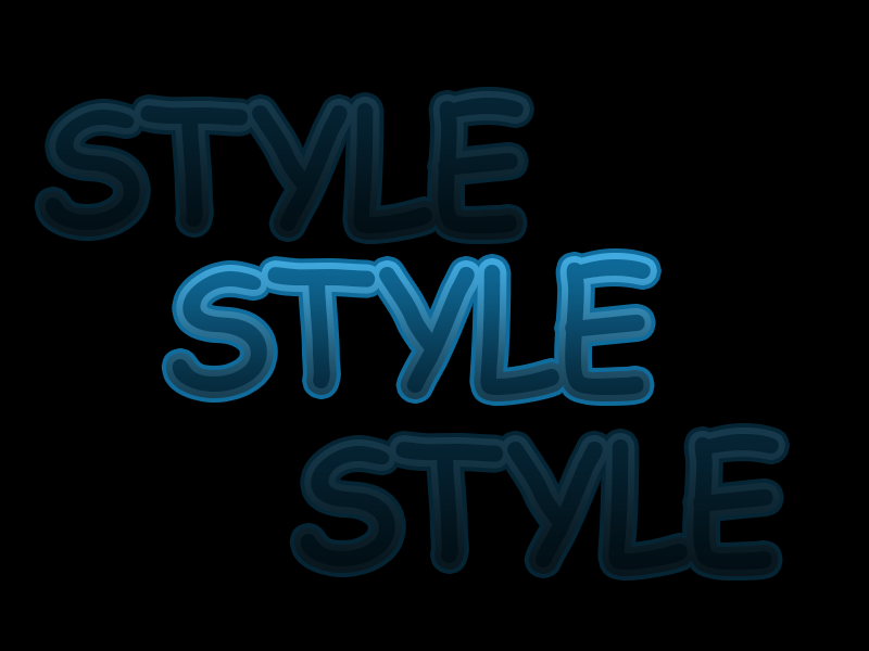
Multi-stroke layer style
This tutorial was taken from Psdtuts.com with the purpose of using multiple stroke layers. As I reflect on this tutorial in I see the importance layer order and organization. I added in the two duplicated layers at a lower opacity as i believed it improved on the tutorial. A small gradient overlay also added a small glowing effect.
